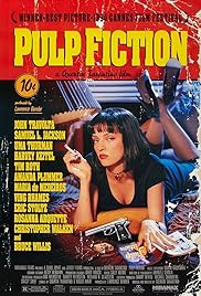
I looked at posters of films that are the same genre as our media product to gather some ideas.
Despite the tone of most of these movies being dark, the posters are relatively saturated. I also notice that the majority of the posters use a photo of a protagonist or important character in the film. The text also relates directly to what happens in the film.
Personally, I like the idea of a close up of the protagonist's face (In our case, Patrick Maloney), however this does not seem to be conventional of any of the genres our film covers.
I especially like the Harry Potter poster- the dark colours used, the shadowing and the positioning of the face. It is important to follow international standards for dimensions when making a poster for a film. This means that it will be easier to have your film displayed in a number of different places like the subway, the cinema etc.